ShopDreamUp AI ArtDreamUp
Deviation Actions
Description
Full View Please
 Please go to [link] and check out their gallery, well the contest is now over and I placed in it, Im super syked!!!!
 credits-
 Do1thing.org- [link]
 Color me club who hosted the competition- [link]
 This is my colored version of this lineart- [link]
 Please join the contest- [link]
 This was a lot of fun for me to do, I tried alot of different techniques when painting this, a few that were very helpful, I hope I do good in the contest, wish me luck.
drawn in photoshop CS3 with my Wacom Intuos
drawn in photoshop CS3 with my Wacom Intuos
Image size
529x707px 252.22 KB
© 2009 - 2024 JesseJentzen
Comments119
Join the community to add your comment. Already a deviant? Log In
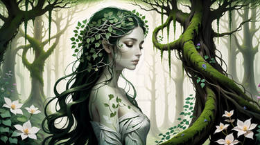
I really like the mood you've acquired in this image. The way you've intertwined the colors of the forest into her make it seem as if she is bound to her environment. What's particularly amazing is that you didn't approach this image as a color artist, but as a traditional painter. Normally, people engage the image, adhering very strictly to the lines presented to them. But by doing a paintover, and just using the lines as a reference enables you to show your creativity magnificently. You take the image, and make it purely your own.
There are a few things I notice. The shading on her arm doesn't seem rounded enough. Looking at the shading style of her face, it has a gradual transition from light to dark as the light difuses from the side. But her arm has a very hard, unshaded edge on the right side, making it look flat.
I also notice her foot. While you went your own way and did a foot independent of the lines (one that's a more relaxed pose considering the leg position), it looks kinda smudged. It also seems darker than the leg, and doesn't share the same highlight intensity of the rest of the skin.
Vision: You do your own thing, and go way above and beyond the basic call of the contest. You took an existing image, and through your own creative input, gave it a whole new breed of light and mood that only acts to emphasize the 'Impaired' theme of the contest.
Originality: You improvised in some parts, and while the composition isn't necessarily your own, you did all that you could to make it your own original, signature contribution.
Technique: I'm absolutely envious of your capability to create an organic textured background. While there are some parts that could stand a little bit of refining like the foot and arm, and while I personally would like a composition that gives a little more textural definition of the fabric, this entry's way above and beyond in its technical merits.
Impact: Overall, this image alone makes the whole of the contest worth hosting. This image is very rewarding to see, after all the work done previously to organizing and maintaining the club's contest.


